2022
60 copies
Signed and numbered
60 copies
Signed and numbered
41×31 cm
16.1×12.2 in.
590g/m2 Lustro paper
16.1×12.2 in.
590g/m2 Lustro paper
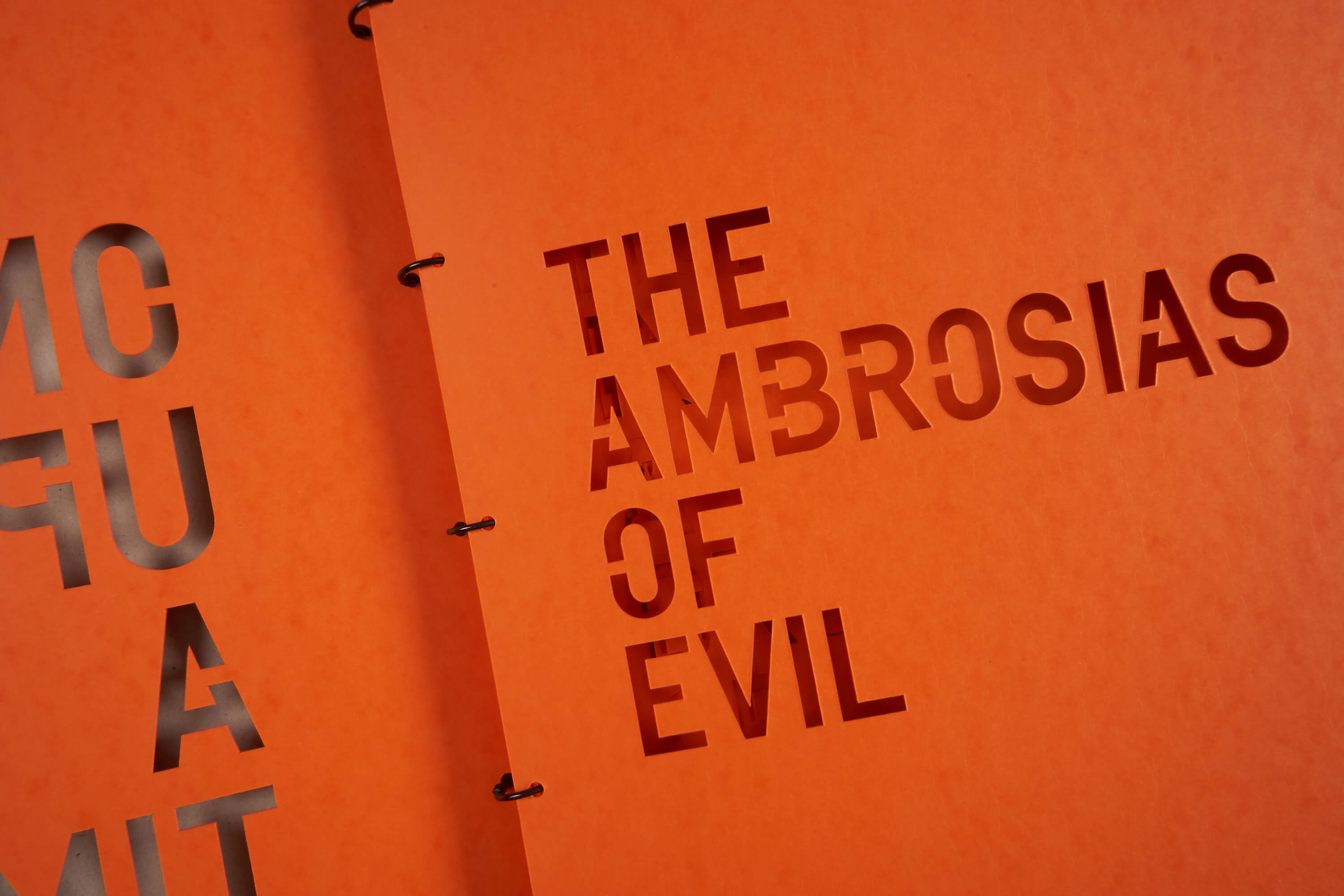
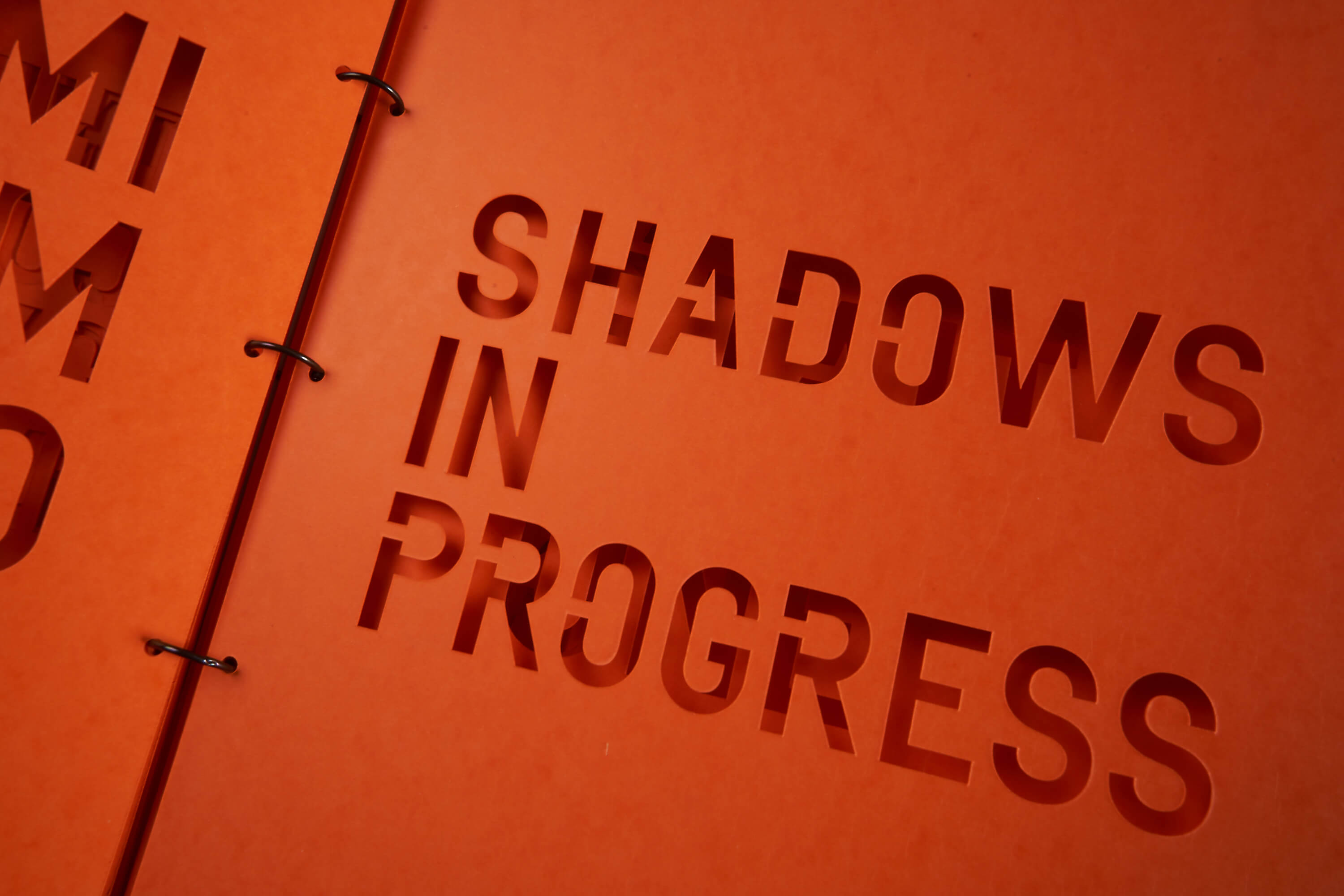
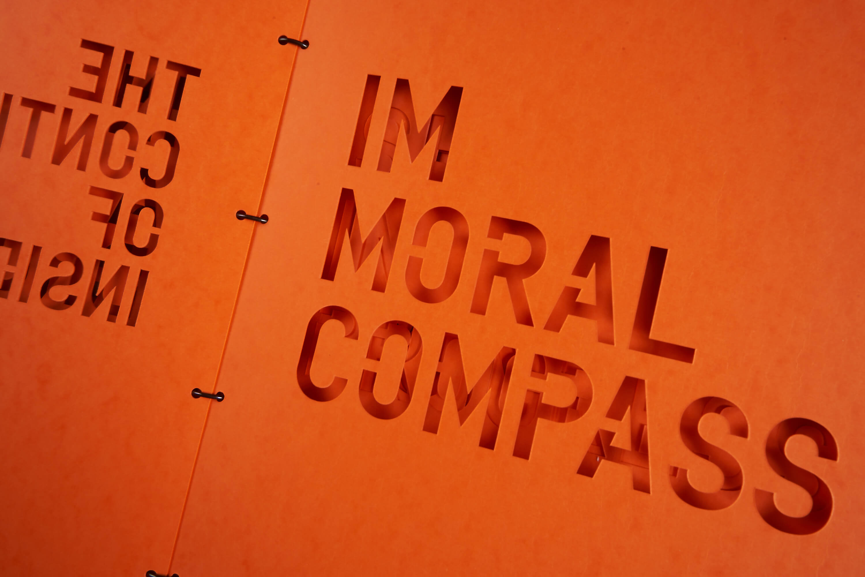
12 Die cut stencils
Printed colophon
Metal binding rings
Printed colophon
Metal binding rings



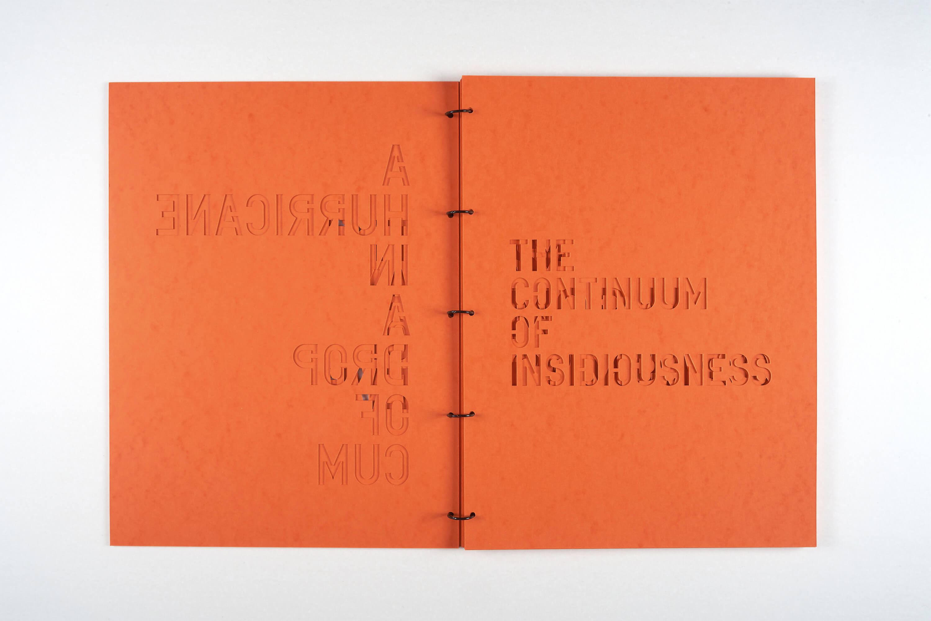


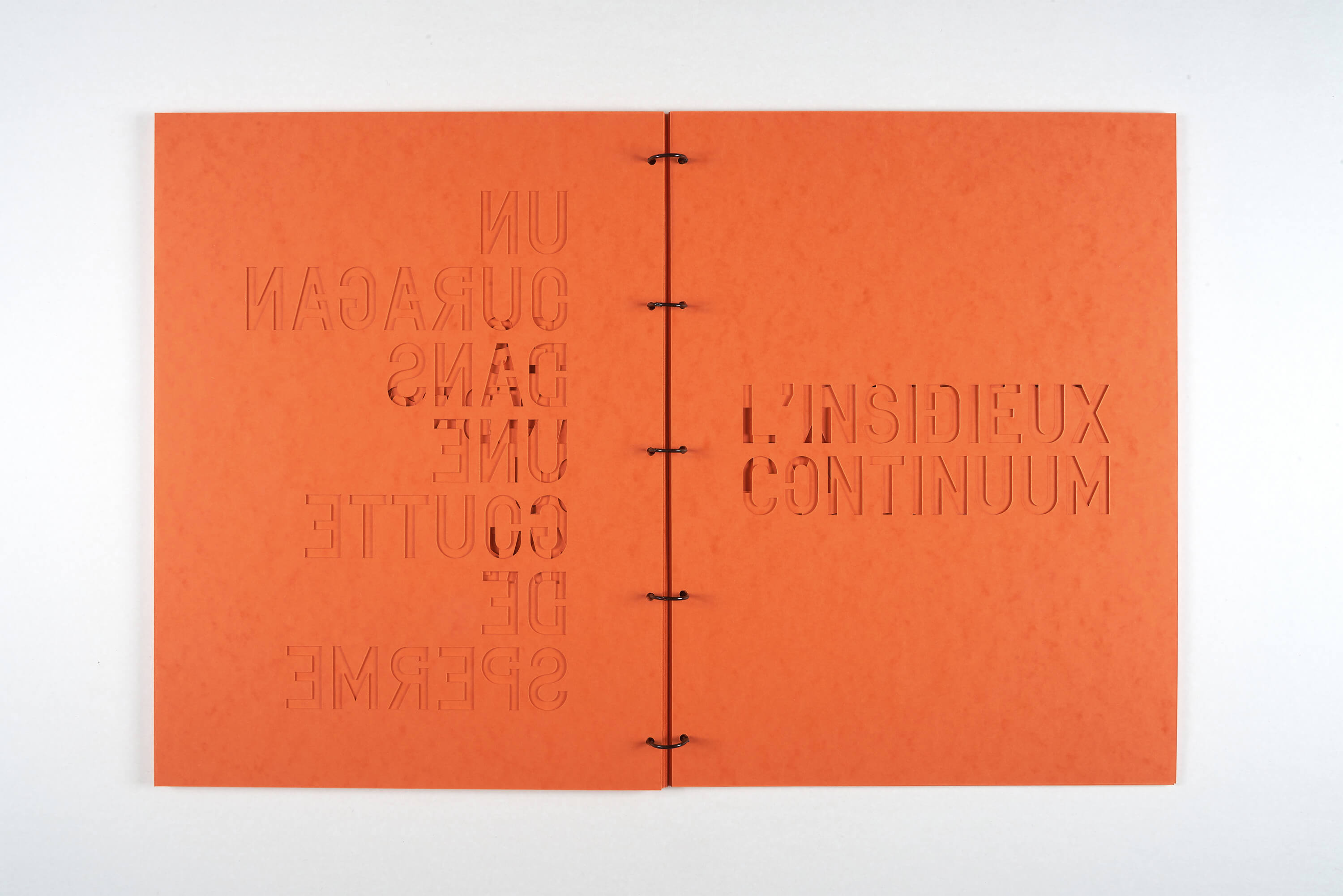
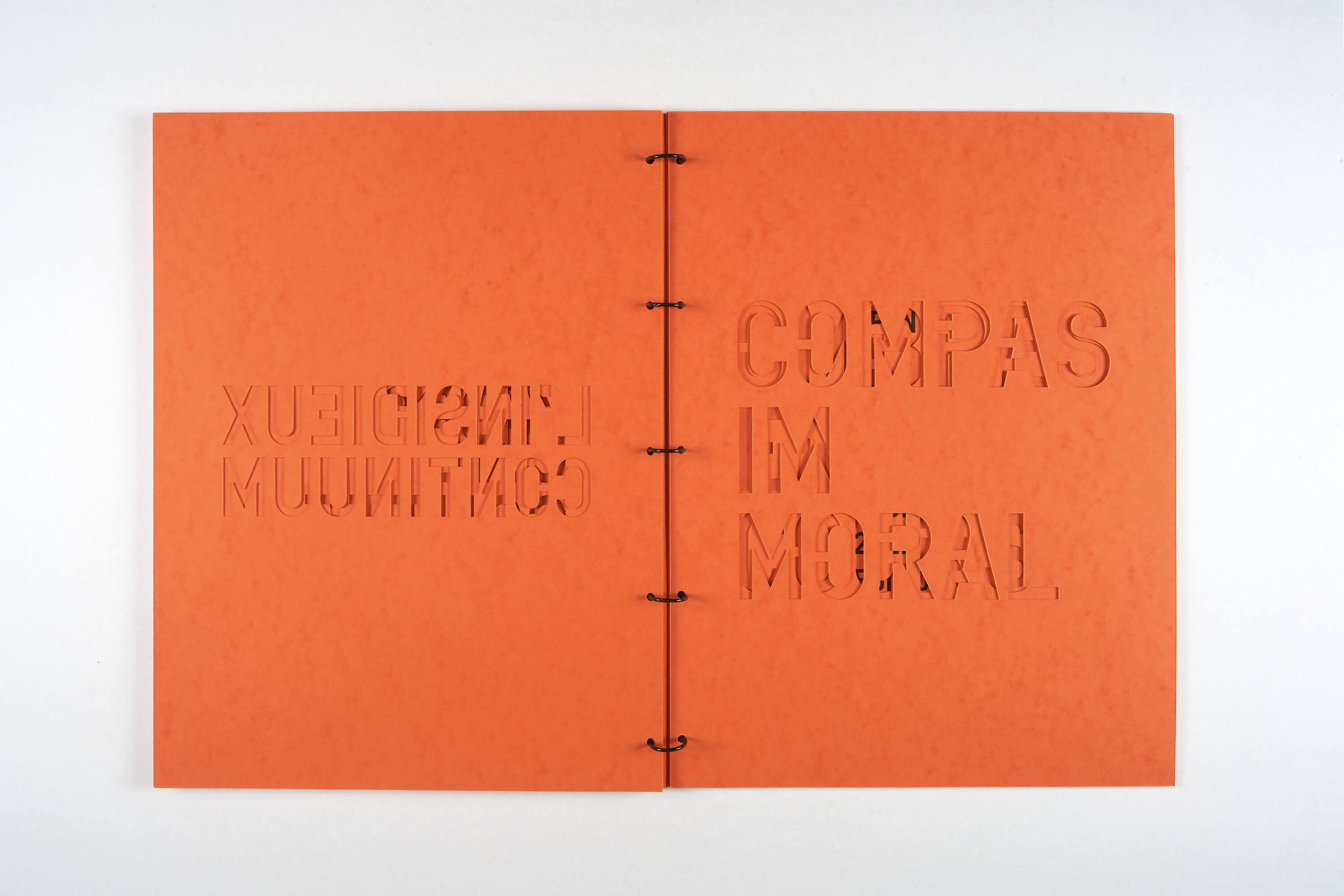

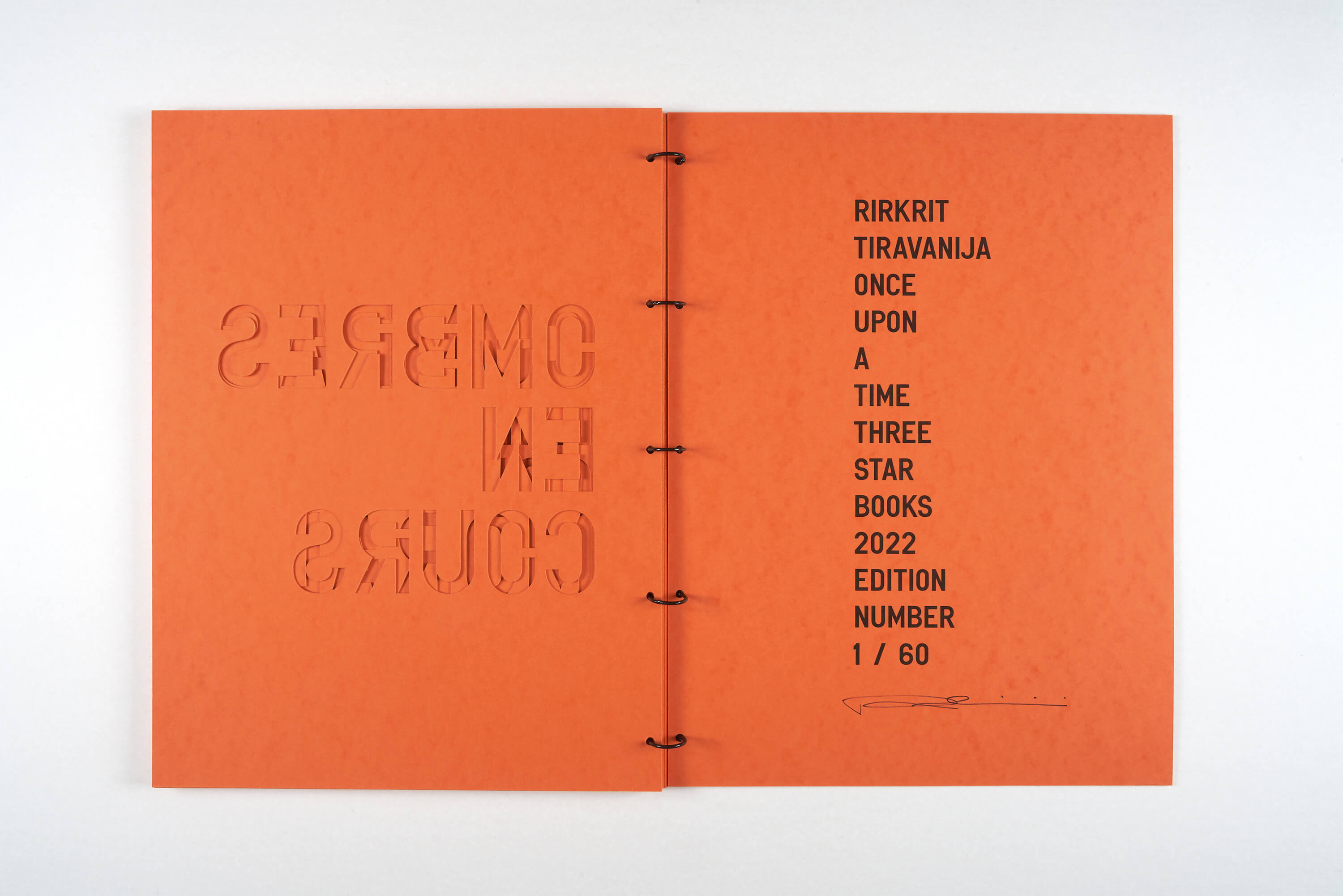

Rirkrit Tiravanija is an artist of many skills: he cooks, paints, sculpts, makes movies, builds houses, curates, teaches. He is also an artist of words. So many words that he needed his very own “corporate” font, the TIRAVANIJA ONE*, designed in 2007 by Chris Rehberger from Berlin’s design studio “Double Standards”. The font has since been used on all of Tiravanija works that involve text, such as paintings, prints, ping pong tables and even marble sculptures…
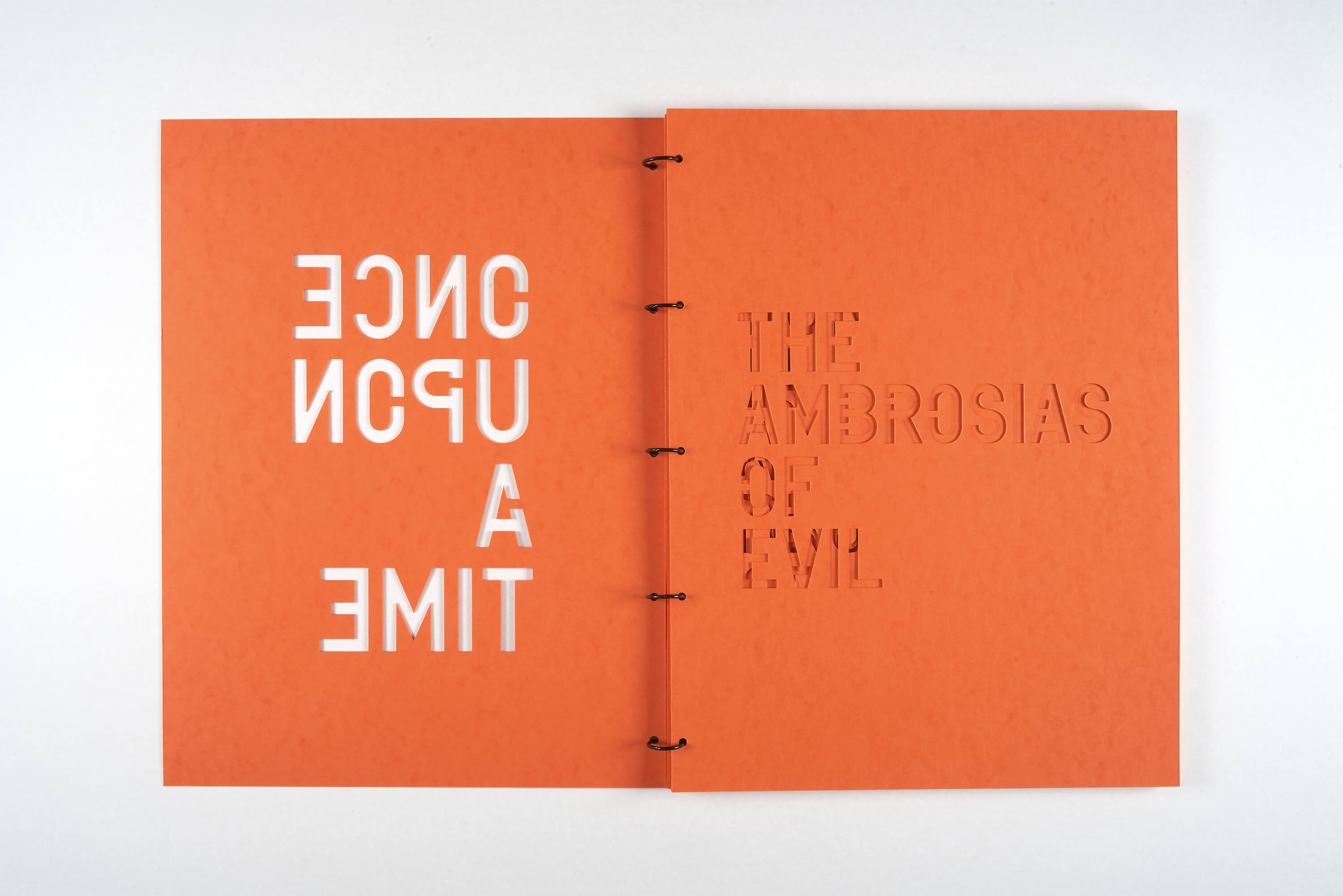
For Three Star Books, Tiravanija had the idea to make a book of stencil, the slogans die-cut on a hefty orange “Lustro” card, a specialty paper produced in France. In Thai culture the color orange or saffron represents simplicity and detachment from materiality, the perfect choice for this book of spiritual aphorisms.
In the style of a Bauhaus research book with its plain and functional design, ONCE UPON A TIME is composed of six slogans in English, followed by their French translations, arranged by the artist so as to create a “poem” to be read from page one to twelve.
The slogans composing this volume were selected from a series of works exhibited at Galerie Chantal Crousel, Paris, in 2018. Most of the individual phrases —though sometimes misquoted as Rirkrit Tiravanija is happy to admit— can be easily tracked back to John Giorno’s poems, video games, high literature, TV shows or the artist’s everyday‘s wandering and procrastination…
Thanks to the binding rings, the die cut individual stencils are usable and can be sprayed to easily diffuse Tiravanija’s « activist » poetry.
*”When Rirkrit Tiravanija asked us in 2007 to design a typeface based on a stencil he brought back from Venice it didn’t take us too long to agree on it, since we were supposed to design his poster for the Guggenheim show THEANYSPACEWHATEVER, and his documentary CHEW THE FAT that was part of it. What took us by surprise and a little while longer than we thought at first was the optimization process, since our goal was to keep the font’s stencil-like appearance and at the same time to even out the more or less too obviously wrong bits of it. As there were minimal corrections necessary in stroke and letter widths, curves and corners. The typeface TIRAVANIJA ONE was then used by us to design the poster and film titles of CHEW THE FAT and is since then an inherent part of Rirkrit’s repertoire in paintings and prints.”
Chris Rehberger
(from the text that accompanied the presentation of the TIRAVANIJA ONE type specimen at BOOK MACHINE, Centre Pompidou, curated by Christophe Boutin and Mélanie Scarciglia - 20 February - 11 March 2013 @ Le Nouveau festival du Centre Pompidou)
